
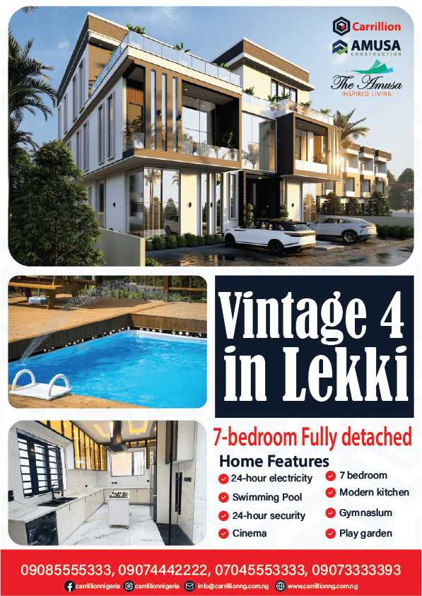
Vintage 4 in Lekki – Luxury 7-Bedroom Fully Detached Home Marketing Flyer Design
The Brief:
Carrillion Construction required a compelling, SEO-friendly promotional flyer for Vintage 4, an exclusive residential property located in Lekki. The objective was to market a massive 7-bedroom fully detached residence by featuring both exterior renders and interior/amenity photographs—specifically highlighting high-end features such as a private swimming pool, modern kitchen, in-house cinema, gym, play garden, 24-hour security, and uninterrupted electricity—to target luxury real estate buyers and investors.
The Solution:
A multi-image promotional design engineered to display property luxury from every angle. The upper section showcases a high-resolution 3D exterior render, complemented by a secondary grid displaying real life shots of the outdoor swimming pool deck and custom-designed modern kitchen. HighThe layout is clean and impactful, but adjusting typography alignment, spacing, and visual contrast will polish the design into a top-tier real estate flyer.
Visual & Typography Refinements
Headline Font Choice: The high-contrast serif font used for “Vintage 4 in Lekki” feels slightly dated for a ultra-modern architectural build. A bold, clean geometric sans-serif (like Montserrat, Cinzel, or Outfit) would match the building’s sleek lines better.
Text Alignment & Padding: The main title “Vintage 4 in Lekki” is touching the bottom edge of its dark blue container. Adding inner vertical padding will prevent it from feeling cramped.
Icon & Text Alignment: In the “Home Features” grid, the red checkmarks vary slightly in vertical alignment with the body copy. Ensure checkmark icons align perfectly to the vertical center or top line of the text.
Typo Correction: Under features, “Gymnaslum” is misspelled. Update this to Gymnasium.
Layout & Composition Suggestions
Image Balance: The top hero rendering is dominant and strong. However, the kitchen photo in the bottom-left feels slightly stretched horizontally to fit its box. Maintaining its natural aspect ratio or using a wider shot will keep the cabinetry proportions natural.
Hierarchy in Headline Section: Bold “7-bedroom Fully detached” works well, but creating a clear visual separator between the property title and this sub-headline will give the design more breathing room.
Footer Contact Details: The white phone numbers on the bright red bar have good contrast, but grouping them in 2×2 rows or standard spaced formats (e.g.,
0908 555 5333) makes them easier to skim quickly.