Meridian Court – Brand Identity & Visual Style Guide Showcase
The Brief:
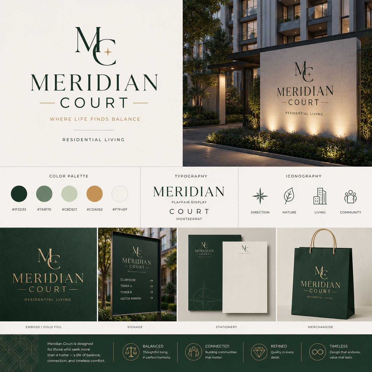
Meridian Court required a comprehensive corporate brand identity and visual style guide for a luxury residential property development. The objective was to create an sophisticated, cohesive brand system—encapsulating tagline positioning (“Where Life Finds Balance”), primary logotype, color palette, typography hierarchy, iconography, and multi-touchpoint brand applications—designed to position the development as an architectural landmark centered on balance, connection, and refined living.
The Solution:
An SEO-friendly brand identity showcase board engineered to present a holistic corporate visual identity. The design pairs a high-contrast serif logotype (Playfair Display and Montserrat) with an organic color palette featuring deep forest green (#1F3D33), muted sage, warm gold (#CDA062), and off-white (#F7F4EF). The layout integrates 3D architectural entrance signage, gold foil embossing, wayfinding signage, stationery sets, and branded merchandise, anchored by core brand pillars (Balanced, Connected, Refined, Timeless) for prospective investors and buyers.