
Onibokun Oluwatobi Samson Birthday Celebration – Carrillion Construction Corporate Graphic Design
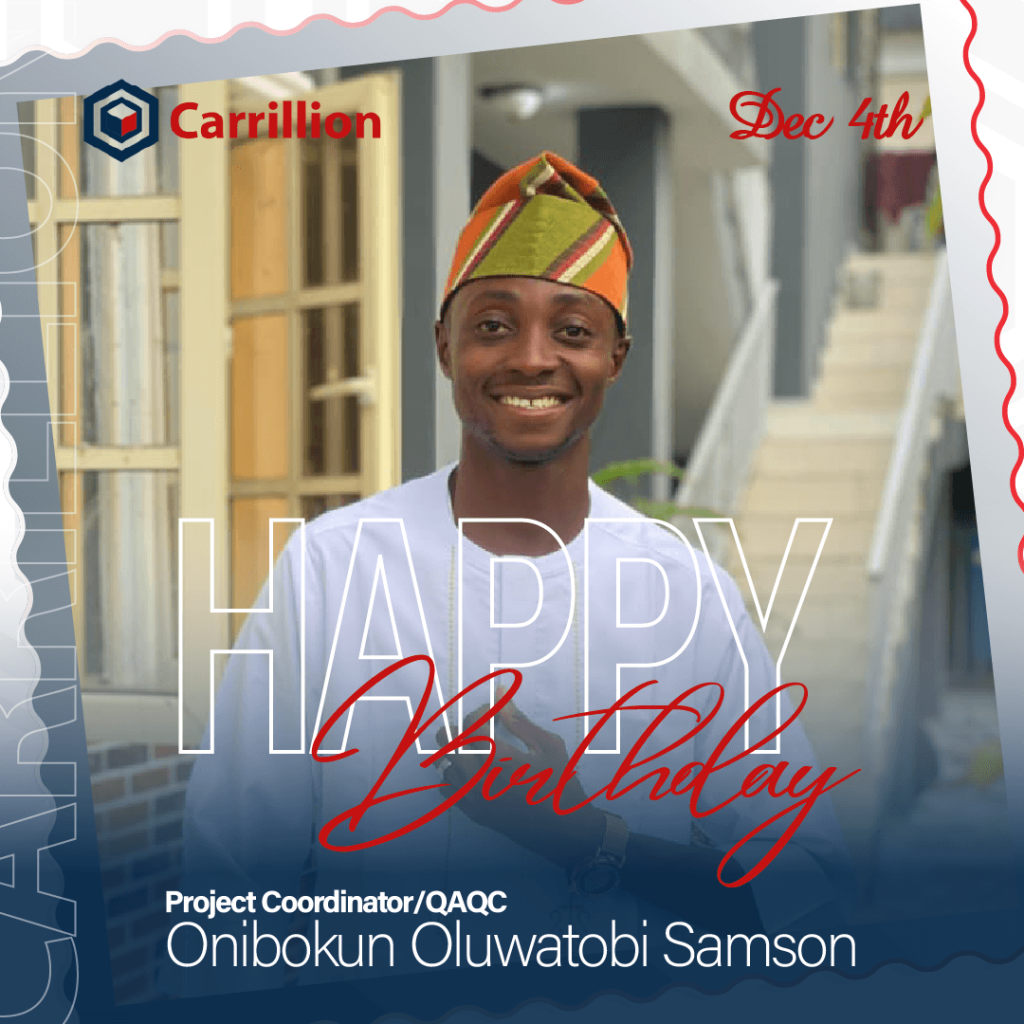
Onibokun Oluwatobi Samson Birthday Celebration – Carrillion Construction Corporate Graphic Design The Brief: Carrillion Construction required a vibrant, professional birthday graphic for team member Onibokun Oluwatobi Samson, Project Coordinator/QAQC. The goal was to create an engaging corporate social media asset celebrating staff milestones while reinforcing company branding. The design needed to feature his portrait in traditional attire, highlight key details including his full name, role, and birth date (Dec 4th), and incorporate modern graphic overlays with stamp-style framing. The Solution: An SEO-friendly corporate celebration graphic engineered for strong social media presence and brand alignment. The composition centers a portrait of Onibokun framed within a stamp-like border effect against a modern architectural background. The typographic treatment creatively layers large outlined sans-serif text (“HAPPY”) with a vibrant red cursive script overlay (“Birthday”), complemented by clean, high-contrast role and name details along a dark blue base overlay to ensure optimal readability. Client: Carrillion Construction
Faith O. Iyere Birthday Celebration – Carrillion Construction Corporate Graphic Design
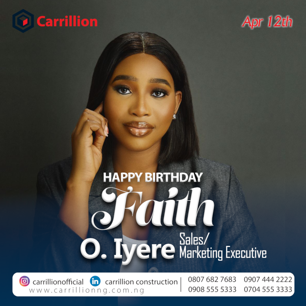
Faith O. Iyere Birthday Celebration – Carrillion Construction Corporate Graphic Design The Brief: Carrillion Construction required a professional, elegant birthday celebration graphic for team member Faith O. Iyere, Sales/Marketing Executive. The objective was to design a corporate social media asset that celebrates employee milestones while staying aligned with company branding, featuring key details such as her role, birth date (Apr 12th), official contact details, and social channels. The Solution: An SEO-friendly corporate celebration graphic engineered for high visual impact and polished brand presentation. The composition places a studio portrait of Faith centered against a dark grey background, paired with clean typography that layers bold sans-serif headers (“HAPPY BIRTHDAY”) with an elegant white script font for her name (“Faith”). A structured white footer capsule grounds the design, displaying official company social handles, website URL, and direct contact lines for seamless brand consistency. Client: Carrillion Construction
Amusa Construction – Derrick Freimond Corporate Birthday Graphic Design
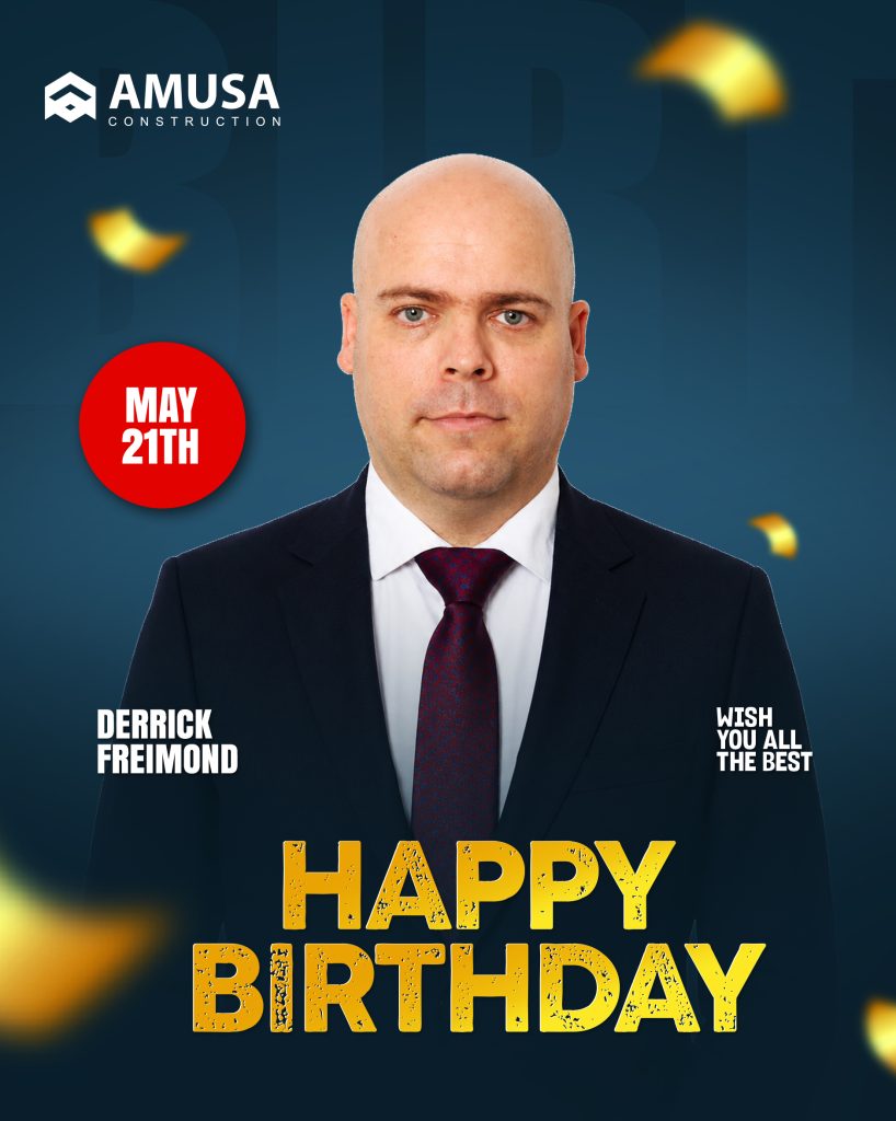
Amusa Construction – Derrick Freimond Corporate Birthday Graphic Design The Brief: Amusa Construction required a professional, celebratory corporate birthday graphic to honor employee Derrick Freimond. The objective was to design a polished digital graphic for social media and internal announcements, blending the company’s brand identity with key details like the date (May 21st) and a warm personal message. The design needed to maintain an executive feel, suitable for leadership. The Solution: An SEO-optimized corporate birthday graphic designed to recognize employee milestones while strengthening Amusa’s brand presence. The layout centers a clean portrait of Derrick Freimond in an executive dark suit and tie, set against a rich gradient blue background with festive golden confetti accents. Key elements, such as the white serif logo and the text details, are structured for maximum visual hierarchy, featuring custom bold gold typography for the main headline and a distinct red date badge for instant scannability. Client: AMUSA SCREEDING CEMENT
Carrillion Christmas Collection – Corporate Gift Box Packaging Design & Mockup
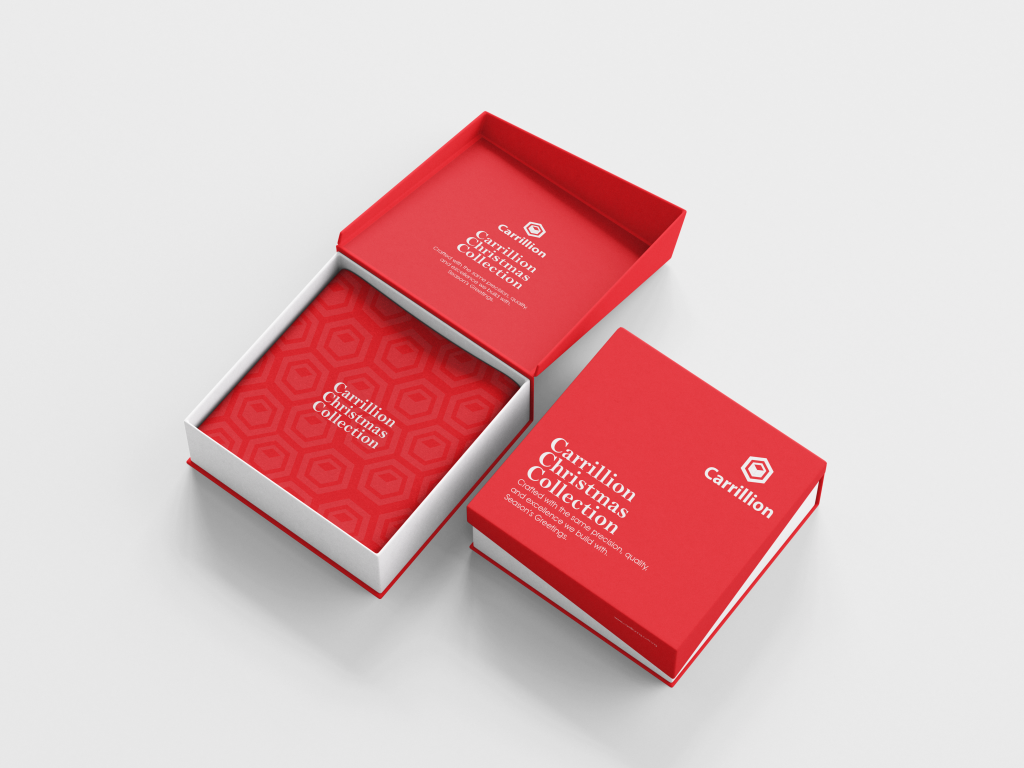
Carrillion Christmas Collection – Corporate Gift Box Packaging Design & Mockup The Brief:Carrillion Construction required a high-end corporate gift box packaging design for the “Carrillion Christmas Collection.” The project called for a premium festive branding concept that aligns luxury construction craftsmanship with holiday client appreciation. The package design needed to feature custom typography, branded geometric pattern inserts, festive message copy (“Crafted with the same precision, quality, and excellence we build with. Season’s Greetings.”), and clean brand application across rigid box packaging. The Solution:An SEO-optimized corporate packaging design and 3D product mockup engineered to showcase holiday brand collateral. The concept utilizes a striking crimson red and white color scheme, pairing crisp white serif typography with subtle geometric box-logo patterns inside the interior tray. Displayed in a two-piece rigid gift box mockup (showing both open lid and closed box views), the asset presents a refined brand experience for corporate gifting campaigns. Client: Carrillion Construction Jewelery_Box_Mockup_5 Jewelery_Box_Mockup_4 Jewelery_Box_Mockup_3 Jewelery_Box_Mockup_2
Executive Birthday Announcement – Carrillion Construction Corporate Graphic Design

Executive Birthday Announcement – Carrillion Construction Corporate Graphic Design The Brief: Carrillion Construction requested a corporate birthday celebration graphic for executive leadership, honoring Executive Director Adelanwa Shina. The objective was to design a professional, high-energy graphic asset suitable for corporate social media platforms and internal announcements, blending official company branding with executive portraiture and modern graphic accents. The Solution: An SEO-optimized corporate celebration graphic designed for maximum visual impact and brand cohesion. The layout features a prominent full-color portrait as the central focus, flanked by duotone-tinted background portraits to showcase personality while preserving visual balance. Built on Carrillion’s corporate blue color palette, the composition incorporates bold geometric typography (“HAPPY BIRTHDAY”), subtle dot matrix patterns, and crisp title typography (“Adelanwa Shina, Executive Director”) to deliver a polished executive graphic. Client: Carrillion Construction
MOMO Magazine “CLASSIC” – Luxury High-Rise Magazine Cover & Portfolio Mockup Design
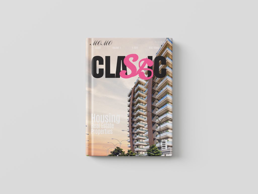
MOMO Magazine “CLASSIC” – Luxury High-Rise Magazine Cover & Portfolio Mockup Design The Brief: MOMO Magazine required an impactful editorial magazine cover and premium hardcover book mockup design for their Volume 1 publication, titled “CLASSIC: Housing, Real Estate, Properties.” The goal was to feature a striking high-rise architectural render against a warm sunset gradient, paired with a custom logotype that incorporates a vibrant hot pink “S&” graphic overlay to position the publication as a trendsetting authority in luxury real estate investment and modern architectural design. The Solution: An SEO-friendly editorial publication design engineered for visual storytelling and digital portfolio presentation. The artwork utilizes high-contrast display typography (“CLASSIC”) integrated directly into the building silhouette, balanced by clean white sub-headlines (“Housing Real Estate Properties”) and a minimalist top publication bar. Presented in a realistic studio hardcover mockup format, the asset delivers a polished showcase suitable for online portfolio presentation and real estate branding campaigns. Client: MOMO Magazine
MOMO Home Design – Luxury Outdoor Living Magazine Cover Design
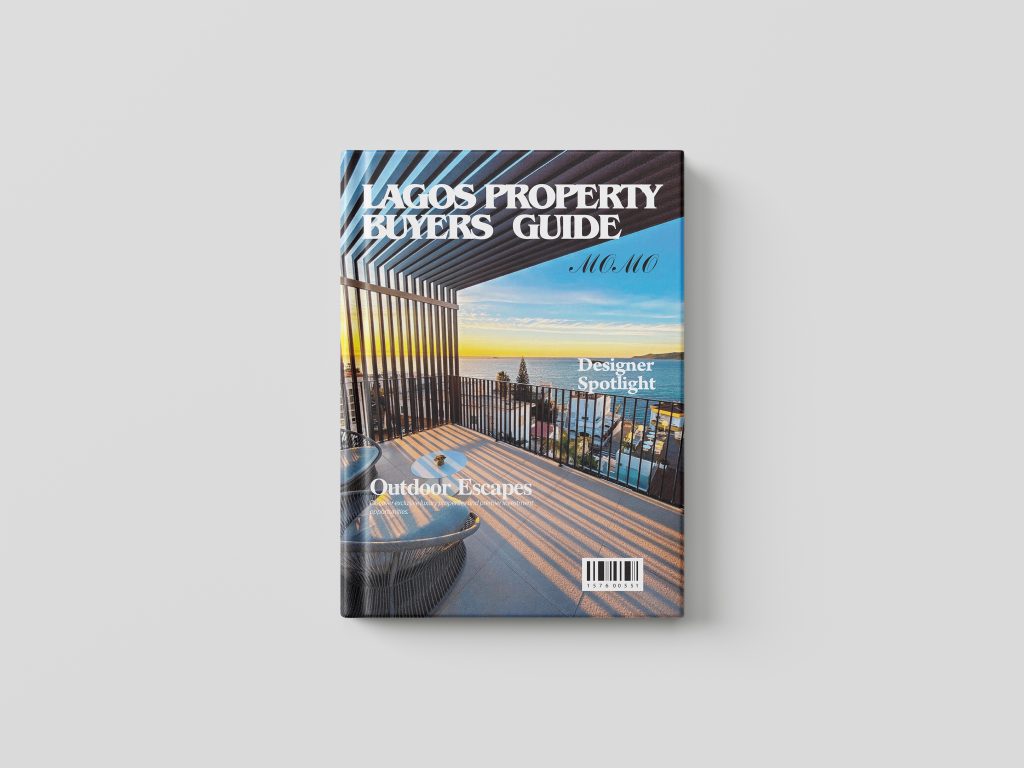
MOMO Home Design – Luxury Outdoor Living Magazine Cover Design The Brief: MOMO Magazine required an editorial magazine cover layout for their “Home Design” issue. The goal was to feature a breathtaking waterfront terrace render showcasing outdoor interior architecture, louvered shade structures, and scenic coastal views. The layout needed to incorporate editorial callouts like “Designer Spotlight” and “Outdoor Escapes: Discover exclusive luxury properties and premier investment opportunities” to appeal to interior design enthusiasts, architects, and high-end property investors. The Solution: An SEO-friendly publication cover design crafted to highlight luxury outdoor aesthetics and architectural detail. The layout utilizes dynamic lighting and shadow patterns from the pergola structure to frame the imagery, paired with high-contrast white serif typography across the top (“HOME DESIGN”). Featuring the signature italicized MOMO sub-brand tag, balanced feature text placement, and an authentic publication barcode at the base, the design delivers a magazine cover for digital portfolio showcases. Visual & Typography Refinements Typo Correction: The main header currently reads “HOME DESGN”. Update this to HOME DESIGN to ensure proper spelling. Header Alignment & Legibility: The left side of the title (“HOME”) overlaps heavily with the dark louvered beams, while the right side (“DESGN”) sits over the light sky. Adding a subtle drop shadow or adjusting the vertical position will ensure consistent readability across the whole word. Headline Contrast: The “Designer Spotlight” text on the right sits over a bright section of the ocean/sky, making it a bit tricky to read at a glance. Adding a subtle da Client: MOMO Magazine
MOMO Magazine “Lagos Property Buyers Guide” – High-Rise Architectural Publication Cover Design
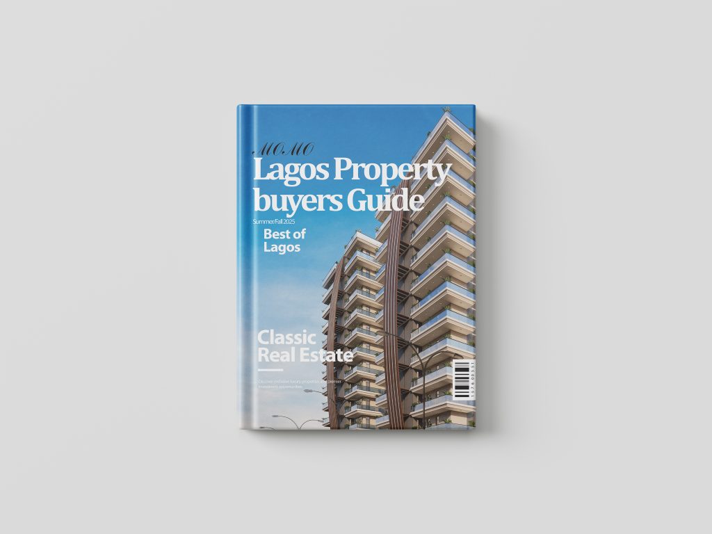
MOMO Magazine “Lagos Property Buyers Guide” – High-Rise Architectural Publication Cover Design The Brief: MOMO Magazine required an editorial cover layout for their Summer/Fall issue, titled “Lagos Property Buyers Guide: Best of Lagos.” The design brief called for an architectural focal point using a luxury high-rise residential structure, integrated with key cover stories such as “Classic Real Estate” and teaser text (“Discover exclusive luxury properties and premier investment opportunities”). The objective was to produce a high-end publication cover tailored to property investors and buyers navigating the Lagos real estate market. The Solution: An SEO-optimized magazine cover layout engineered for visual impact and editorial polish. The composition places a multi-story high-rise render on the right, utilizing the expansive blue sky on the left for crisp typographic hierarchy. Featuring MOMO’s signature italicized masthead, strong serif typography for the issue title, clean sans-serif accents for article callouts, and an authentic barcode graphic, the design provides an editorial presentation suited for luxury property features. Client: MOMO Magazine
MOMO Magazine “Prestige Houses” – Architectural Watercolor Magazine Cover Design
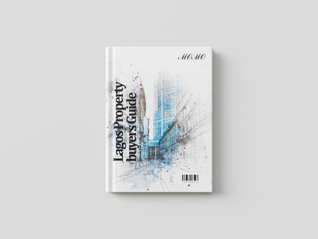
MOMO Magazine “Prestige Houses” – Architectural Watercolor Magazine Cover Design The Brief: MOMO Magazine required an artistic, high-concept cover layout for their Summer/Fall 2025 issue, titled “Prestige Houses: Grow Your Real Estate Portfolio.” Departing from traditional photo renders, the brief called for an illustrative, watercolor-sketch aesthetic featuring classical and modern city architecture to convey heritage, prestige, and high-end real estate investment. The Solution: An SEO-optimized publication layout that blends artistic illustration with editorial structure. The cover features a vertical typographic hierarchy running along the left margin (“Prestige Houses”), giving the graphic a fresh, contemporary layout. The central artwork pairs detailed architectural ink sketching with subtle watercolor splatters in cool blue tones, complemented by the signature italicized MOMO masthead in the top-right corner and a publication barcode at the base. Client: MOMO Magazine
Real Estate Finder by MOMO – Luxury Living Magazine Cover Design
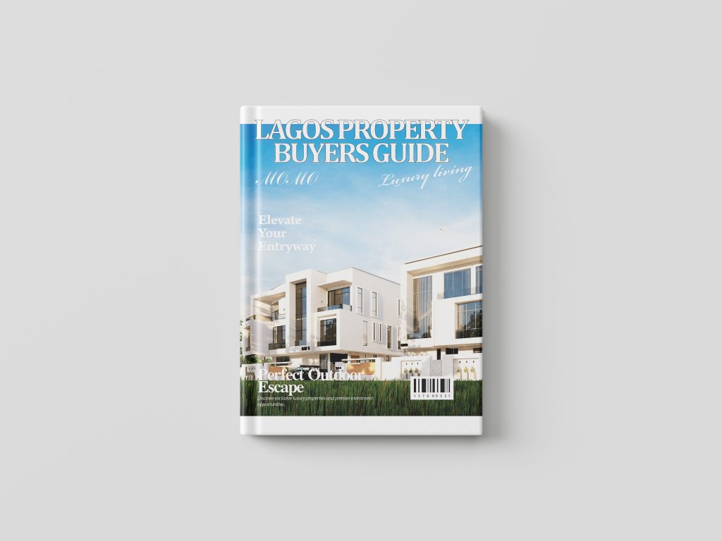
Real Estate Finder by MOMO – Luxury Living Magazine Cover Design The Brief: MOMO required an editorial magazine cover layout titled “Real Estate Finder: Luxury Living” for a premium property publication. The project called for a sophisticated cover composition featuring modern white residential architecture set under an open sky. Key article teasers needed to include design-focused headlines like “Elevate Your Entryway” and “Perfect Outdoor Escape: Discover exclusive luxury properties and premier investment opportunities,” designed to appeal to high-end real estate buyers and investors. The Solution: An SEO-friendly publication cover design engineered for high aesthetic appeal and strong editorial hierarchy. The layout pairs a high-contrast white masthead (“REAL ESTATE FINDER”) with elegant script typography for “MOMO Luxury Living.” Strategic text placement frames the sleek architectural render, balancing open sky space with clear headline callouts and a retail-ready barcode element at the base to deliver an authentic, high-end magazine finish. Client: MOMO