
The Macdonald Place Ikoyi – Tri-Fold Luxury Real Estate Brochure Design
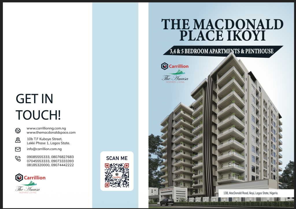
The Macdonald Place Ikoyi – Tri-Fold Luxury Real Estate Brochure Design The Brief: Carrillion Construction and The Amusa Inspired Living required a tri-fold brochure cover design for “The Macdonald Place Ikoyi,” a multi-story luxury residential project offering 3, 4, and 5-bedroom apartments and penthouses. The objective was to craft a corporate property brochure spread featuring architectural renders, key location details (13B, MacDonald Road, Ikoyi), direct contact information, official partner branding, and an interactive “SCAN ME” QR code for prospective buyers and investors. The Solution: An SEO-friendly real estate brochure cover spread engineered for high-end property marketing and sales presentations. The right panel functions as the primary front cover, showcasing a high-resolution 3D exterior render of the high-rise development topped with bold serif headline typography (“THE MACDONALD PLACE IKOYI”) and partner logos. The left panel houses structured corporate contact details (“GET IN TOUCH!”), physical address (10b T.F Kuboye Street, Lekki Phase 1), multiple phone lines, email, and web links, balanced by a light sky-blue central panel featuring a scannable QR code callout. Client: Carrillion Construction View Click here.
Kejie’s Hotels & Suite – Exterior Illuminated Signage Design & 3D Architectural Mockup
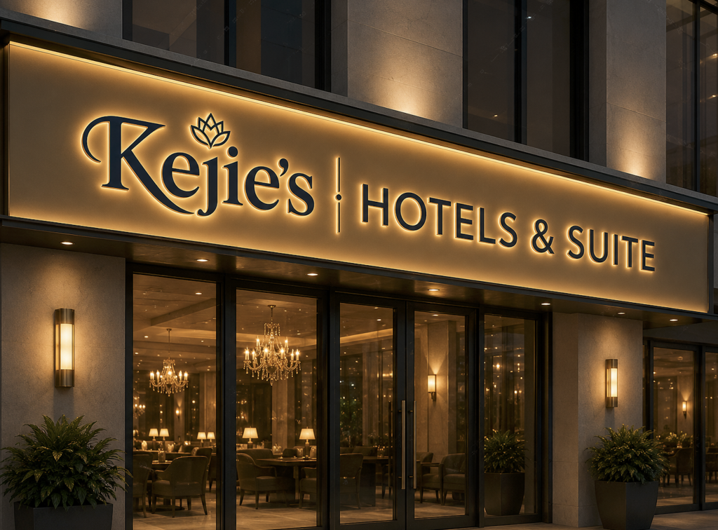
Kejie’s Hotels & Suite – Exterior Illuminated Signage Design & 3D Architectural Mockup The Brief: Kejie’s Hotels & Suites required an exterior architectural signage concept and 3D mockup design for their boutique hotel storefront. The objective was to design a high-end illuminated fascias sign that seamlessly translates the brand’s primary visual identity into physical venue branding, enhancing evening curb appeal while establishing a warm, luxurious entrance aesthetic for arriving guests. The Solution: An SEO-friendly architectural signage mockup created for hospitality branding showcases and portfolio presentation. The design features warm LED backlit channel lettering set on a brushed warm-gold metal fascia panel. Dark navy raised lettering highlights the primary wordmark (“Kejie’s”), crown emblem, and secondary descriptor (“HOTELS & SUITE”), contrasted against soft architectural wall sconces, glass entryway reflections, and luxury interior ambient lighting for maximum visual prestige. Client: Kejie’s Hotels & Suites
Ogle Property Platform – Dual-Sided Acrylic Tabletop Standee Mockup Design
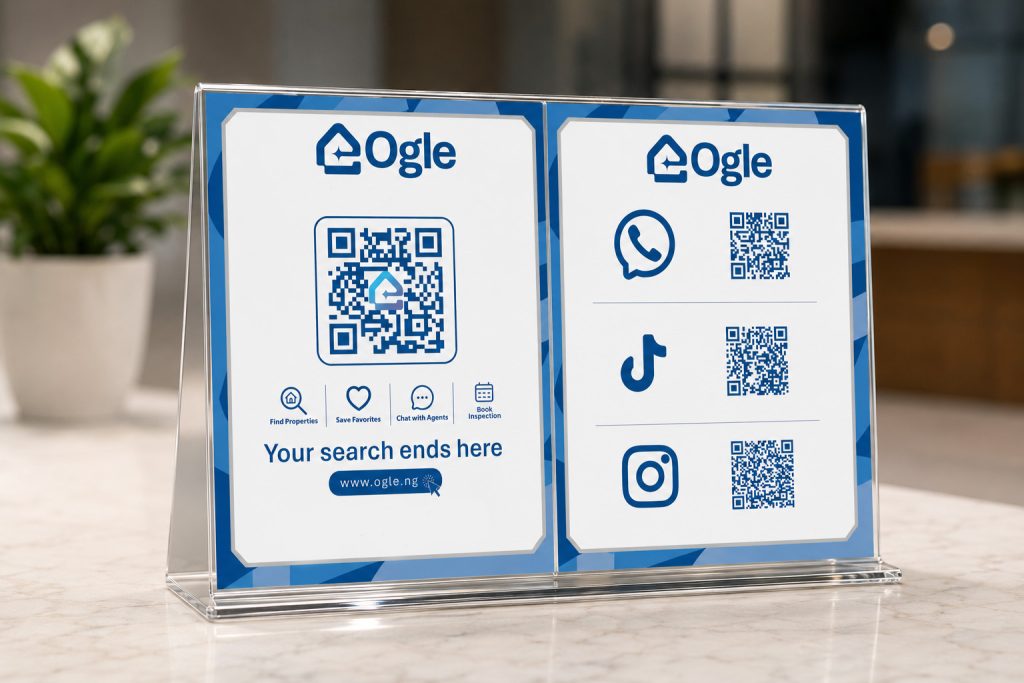
Ogle Property Platform – Dual-Sided Acrylic Tabletop Standee Mockup Design The Brief: Ogle required an interactive, dual-panel acrylic tabletop standee display for reception desks, trade stands, and real estate offices. The objective was to drive direct user engagement and app traffic by featuring scannable QR codes for social platforms alongside core service offerings (“Find Properties,” “Save Favorites,” “Chat with Agents,” “Book Inspection”), brand slogans (“Your search ends here,” “Just Ogle It”), and direct web URL callouts. The Solution: An SEO-friendly tabletop marketing collateral design presented in a crisp, dual-panel acrylic sign holder mockup set against a modern office reception backdrop. The left panel organizes quick-scan QR codes for WhatsApp, TikTok, and Instagram with high-contrast icon alignment. The right panel centers a prominent branded QR code above functional feature icons, supported by bold brand blue framing, clear typography hierarchy, and a direct website CTA (www.ogle.ng). Client: Ogle Property Platform Table top standee design V4 Table top stand design V4 Table top standee design v2 Table top standee design v1
Kejie’s Hotels & Suite – Brand Identity & Visual Style Guide Showcase
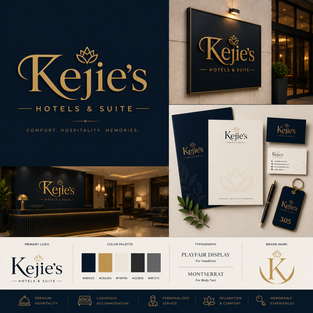
Kejie’s Hotels & Suite – Brand Identity & Visual Style Guide Showcase The Brief: Kejie’s Hotels & Suite required a luxury corporate brand identity and visual style guide for a boutique hotel and suite brand. The objective was to craft an elegant identity system centered on core brand pillars—Premium Hospitality, Luxurious Accommodation, Personalized Service, Relaxation & Comfort, and Memorable Experiences—encompassing logo hierarchy, brand tagline (“Comfort. Hospitality. Memories.”), color palette specifications, typography rules, iconography, and physical collateral applications. The Solution: An SEO-optimized brand identity guide showcase engineered for hospitality positioning and client portfolio presentation. The layout pairs a refined serif wordmark and crown-inspired lotus emblem in metallic gold against deep navy (#0B1D33) and warm ivory (#F4EFE6) backgrounds. The style guide highlights 3D exterior wall signage, luxury reception backdrop signage, corporate stationery, business cards, branded room key fobs, and custom brand marks, anchored by Playfair Display headlines and Montserrat body text. Client: Kejie’s Hotels & Suite Kejie Logo v3 Screenshot 2026-08-21 at 2.39.27 pm Screenshot 2026-08-21 at 2.39.43 pm Gemini_Generated_Image_i7rjtmi7rjtmi7rj
Kika Court Lekki Phase 1 – Luxury Real Estate Promotional Flyer Design
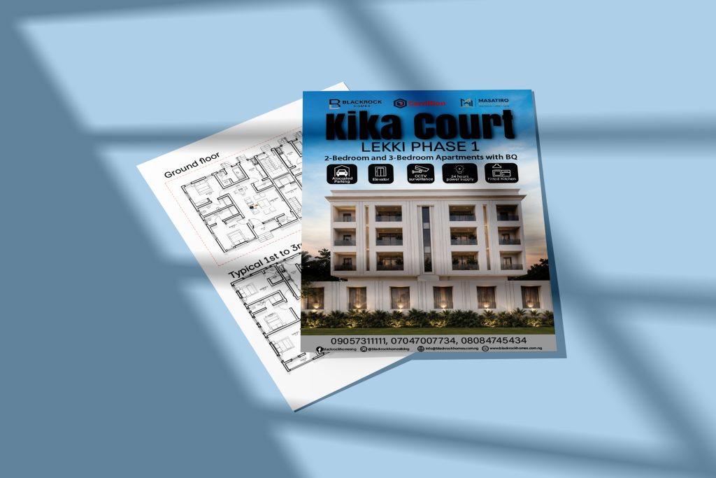
Kika Court Lekki Phase 1 – Luxury Real Estate Promotional Flyer Design The Brief: Blackrock Homes, Carrillion Construction, and Masatiro Estate required a joint promotional flyer and presentation mockup for “Kika Court,” a residential property development in Lekki Phase 1 featuring luxurious 3-bedroom apartments. The objective was to create an architectural flyer design that highlights key development amenities (3 Bedroom, Swimming Pool, CCTV Surveillance, 24 Hours Power Supply, Gymnasium) alongside architectural render imagery, partner logos, and direct sales contacts. The Solution: An SEO-optimized real estate flyer layout presented in a realistic dynamic flyer mockup with soft window shadow overlays. The design features bold, dark typography (“Kika Court”) against a sky gradient background, anchored by a high-resolution exterior architectural render. Structured icon badges highlight premium property features for fast visual scanning, while a high-contrast bottom strip displays developer partner logos, contact phone numbers, social media handles, email address, and official website details. Client: Blackrock Homes, Carrillion Construction Flyer Poster Mockup v2 Flyer Poster Mockup Flyer Poster Mockup
CarayBuild Screeding Cement – Packaging Concept & Brand Presentation
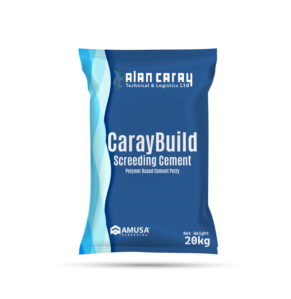
CarayBuild Screeding Cement – Packaging Concept & Brand Presentation The Brief: Alan Caray Technical & Logistics Ltd requested a dual-concept 3D packaging mockup for “CarayBuild Screeding Cement” (Polymer Based Cement Putty, Net Weight: 20kg). The objective was to explore two distinct colorway directions—a rich deep blue variant and a clean white variant—incorporating official entity branding (Alan Caray Technical & Logistics Ltd and CTW Industries), product specifications, abstract wave graphics, and industry handling icons. The Solution: An SEO-friendly packaging design showcase engineered for building material product lines and client portfolio displays. The layout features side-by-side 20kg pillow-pack bag mockups with fluid cyan and azure wave graphics along the left flank. The design highlights bold central product typography (“CarayBuild Screeding Cement”) in high contrast, complete with manufacturer branding at the header and footer, safety handling icons, and net weight details for commercial market readiness. Client: Alan Caray Technical & Logistics Ltd CareyBuild Screeding Cement V1 CareyBuild Screeding Cement V2
Amusa Screeding Homesure – 20kg Product Packaging & Mockup Showcase Design
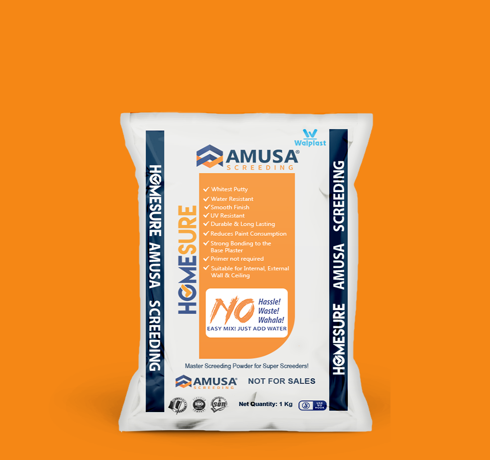
Amusa Screeding Homesure – 20kg Product Packaging & Mockup Showcase Design The Brief: Amusa Screeding required a 3D product render and packaging graphics layout for “Homesure Amusa Screeding” master screeding powder (20kg bag). The objective was to design a clean, industrial product mockup presented inside a warehouse environment on a wooden pallet, incorporating product USPs, feature checklists (“Whitest Putty,” “Water Resistant,” “No Hassle! Waste! Wahala!”), Walplast sub-branding, and industry certification badges. The Solution: An SEO-friendly packaging design and 3D product visualization created for commercial catalog and portfolio presentations. The composition displays a 20kg screeding bag mockup centered on a wooden pallet against a depth-of-field warehouse backdrop. The packaging layout features a vibrant orange central panel detailing key product features and benefit callouts, framed by vertical navy branding bands (“HOMESURE AMUSA SCREEDING”), certification stamps, and net weight specifications at the base. Client: Amusa Screeding Cement
Amusa Screeding – Corporate Company Profile Brochure Spread Design
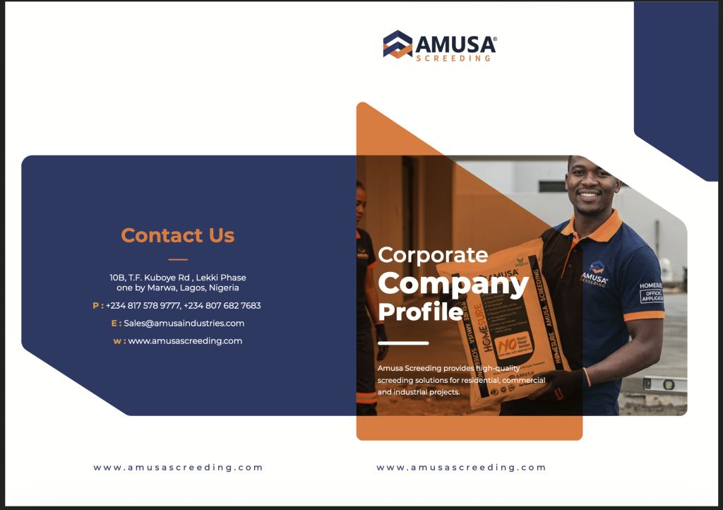
Amusa Screeding – Corporate Company Profile Brochure Spread Design The Brief: Amusa Screeding required a clean, corporate brochure cover and back-spread layout for their “Corporate Company Profile.” The objective was to design a professional document layout showcasing product application in real-world construction settings, complete with corporate contact information, brand mission copy (“Amusa Screeding provides high-quality screeding solutions…”), primary logos, and structured geometric color overlays. The Solution: An SEO-friendly corporate profile layout engineered for B2B presentation and digital client proposals. The design pairs a full-color photography panel featuring a branded worker with Amusa product packaging on the front cover, balanced by an orange translucent geometric card. The back panel incorporates a dark navy geometric block housing high-contrast white and orange contact details (“Contact Us”), physical location address, contact numbers, email, and web address for seamless brand communication. Client: Amusa Screeding Cement View Click here.
Amusa Screeding Cement – B2B Customer Proposal Document Cover Design
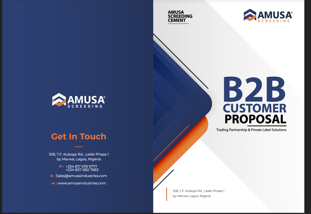
Amusa Screeding Cement – B2B Customer Proposal Document Cover Design The Brief: Amusa Screeding Cement required a professional corporate document cover layout for their “B2B Customer Proposal: Trading Partnership & Private Label Solutions.” The objective was to design a clean, high-impact front and back cover spread suitable for formal business presentations, incorporating official corporate branding, office contact information, clear typography hierarchy, and dynamic geometric brand framing. The Solution: An SEO-friendly document cover design crafted for B2B sales proposals and corporate portfolio presentations. The layout features a dual-panel composition: a solid deep navy back cover displaying clear white and orange contact details (“Get In Touch”), and a crisp white front cover anchored by large bold navy typography (“B2B CUSTOMER PROPOSAL”) and vibrant orange geometric accents. Complete with physical location addresses, phone contacts, email, and web links, the design provides a polished, corporate look for corporate proposals. Client: Amusa Screeding Cement View Click here.
Amusa Screeding – Branded Corporate Trucker Cap Mockup Design
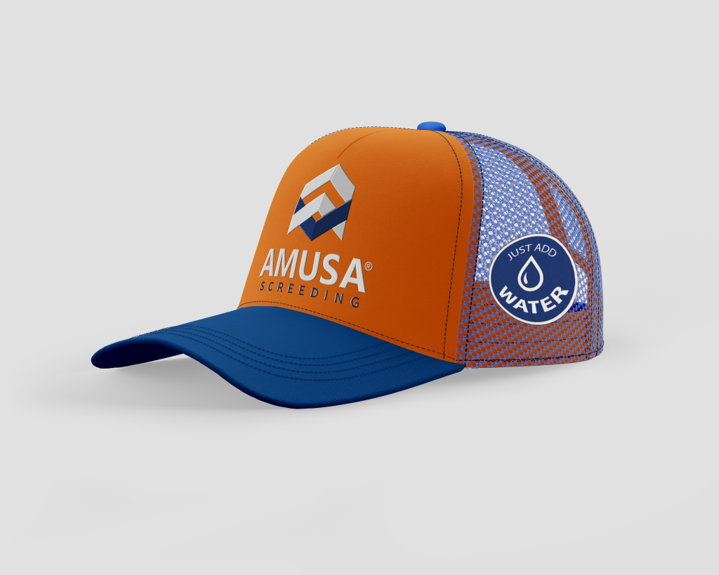
Amusa Screeding – Branded Corporate Trucker Cap Mockup Design The Brief: Amusa Screeding required a custom merchandise cap mockup for their site gear and promotional apparel lineup. The objective was to design a functional, high-visibility trucker hat that incorporates official company branding on the front panel alongside a secondary product feature badge (“JUST ADD WATER”) on the side mesh panel to promote ease of application for site workers and trade partners. The Solution: An SEO-friendly product design showcase featuring a two-tone mesh trucker cap with orange front panelling and a royal blue isor and mesh back. The front features the primary Amusa 3D geometric chevron icon above clean white and navy block typography (“AMUSA SCREEDING”). The side mesh panel displays a circular “JUST ADD WATER” droplet icon badge, delivering a clear product USP while maintaining crisp apparel branding for site gear and marketing kits. Client: Amusa Screeding Free_Baseball_Cap_Mockup_2 Cap v28497